

Trend Alert: Colour 2017
“Colours express the main psychic functions of humans” – Carl Jung
Do you often struggle to decide on a colour palette for your design projects? Colour and colour psychology play an important role in communicating with your audience.
Your colour choice can influence your audience both consciously and subconsciously. Mindfully choosing colour rather than intuitively playing with it, can help speed up your design process and result in more effective design solutions.
Colours schemes, like other design trends, are cyclic. Below we take a look at some of the trends we have seen in 2016 and what lies ahead for next year.
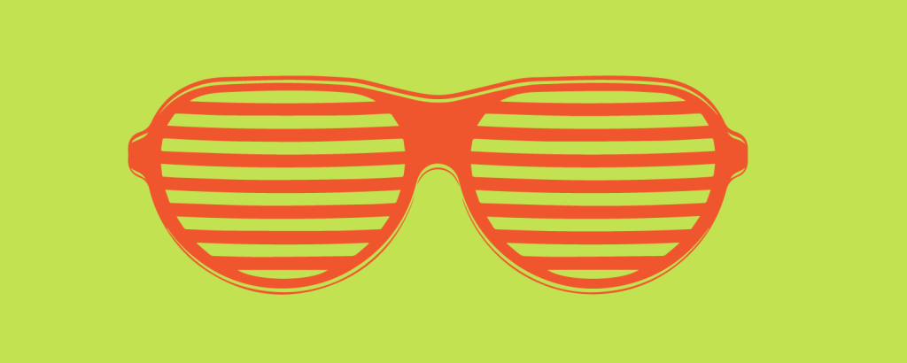
1. The bold and the beautiful
Bold, bright colours were everywhere in 2016. Colours that evoke strong emotions and feelings have been a driving force behind many campaigns. According to Pantone colour forecasters, we will continue to see more of these next year, coupled with more earthy natural colours.
Expect to see more yellow. Joyous bright yellows and contemplative deep greens make an interesting mix. Yellows exude optimism and warmth and are very versatile.
How to use them
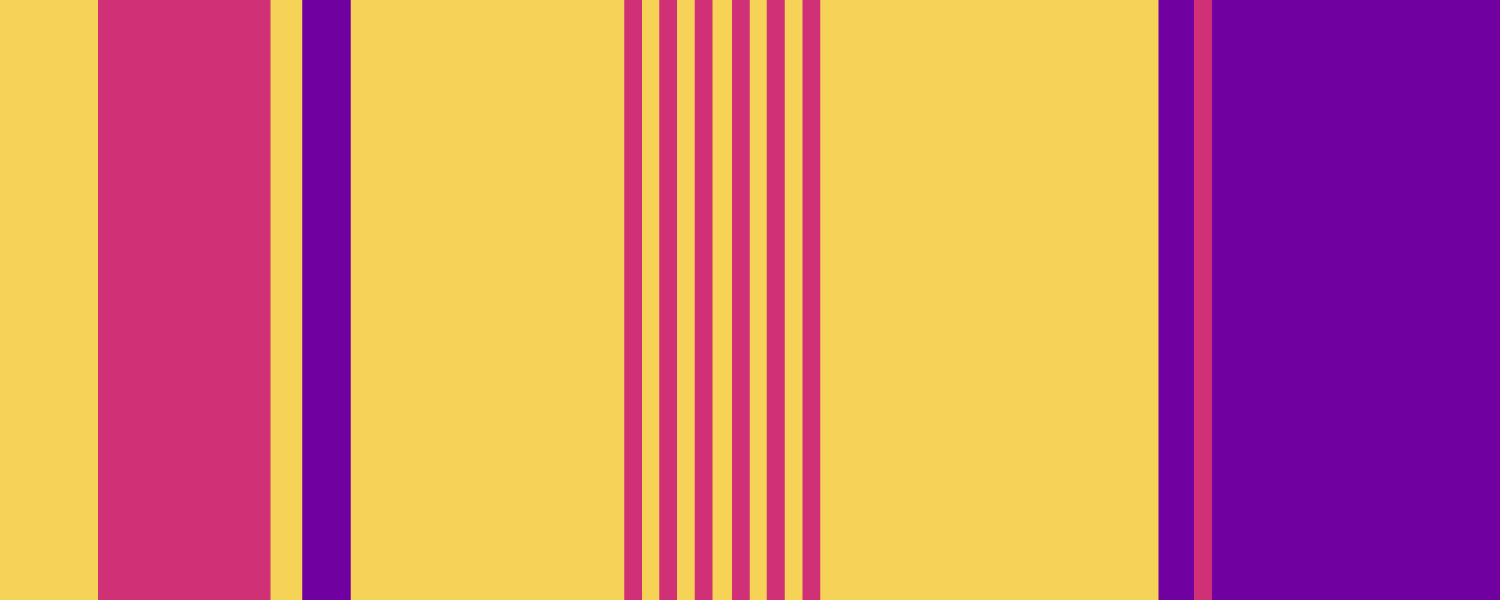
Yellows work well with their split complements – red violet and blue violet. This colour scheme gives wonderful dimension. Use yellow as your base colour and it’s compliments as accents.
Our pick
For a bold statement, yellows work really well with their split compliments blue violet and red violet. This colour scheme is very bold, because of the high contrast. However when used correctly, it is also a very harmonious colour combination.
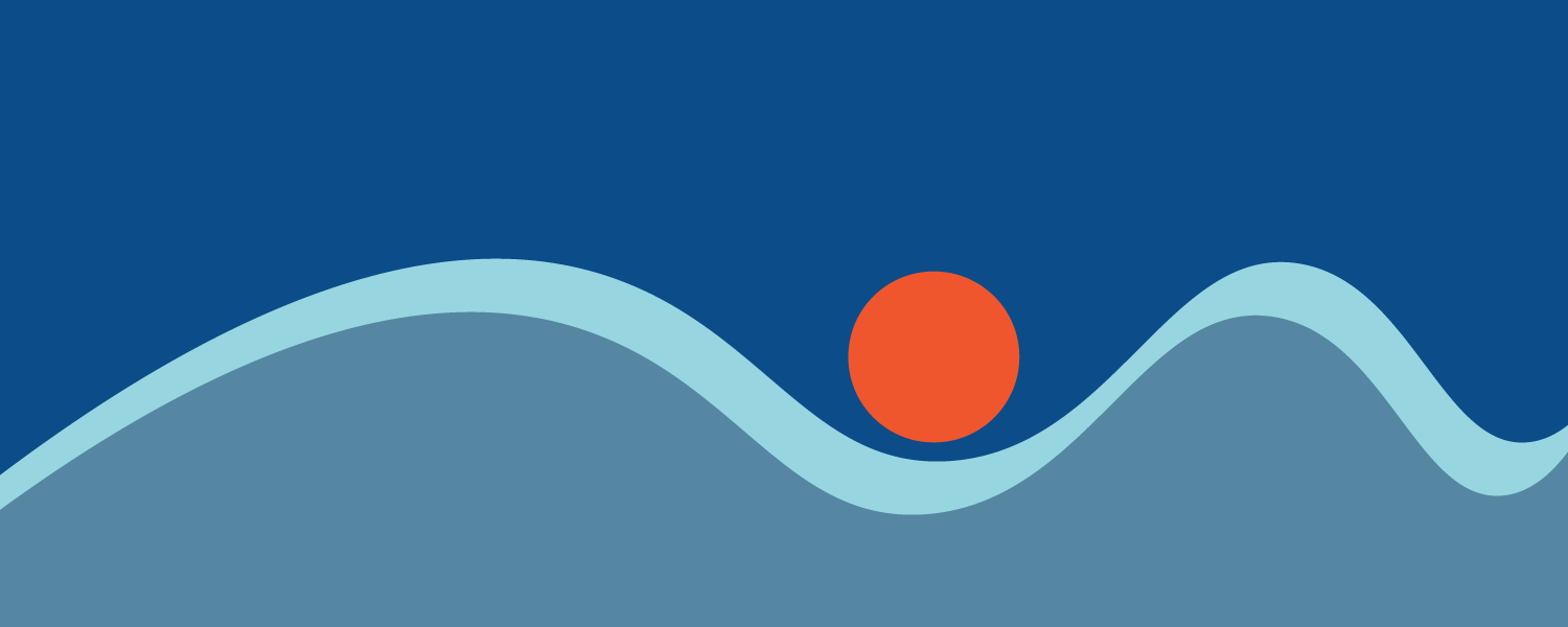
2. Singing the blues
One colour that promises to make headlines next year is a classic denim blue. This calming hue evokes ease and relaxation. Pantone have identified their own Niagara as being a ‘comfortable and dependable’ colour that is familiar. Brighter blues will also be on trend.
How to use them
Denim blue is an easy fit with muted orange. Intense blues work well when teamed with a muted coral pink or fiery red orange.
Our pick
Muted blues can calm any piece and are well balanced with warmer hues. A splash of red orange in a sea of blue makes an eye catching combination.
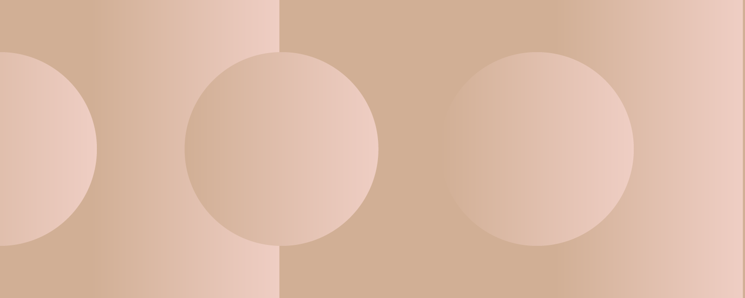
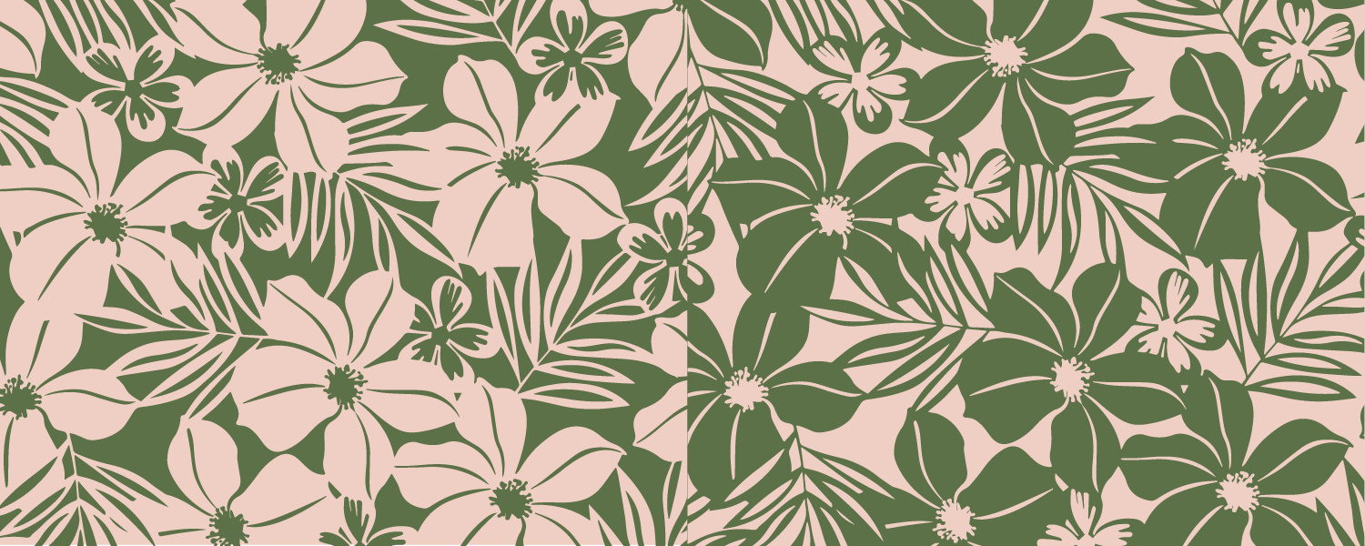
3. Keep calm
Tranquil colours will also have their place in 2017. Subtle and soft pinks have been around a lot this year. These peaceful hues illicit innocence and purity. Neutrals and nudes are an unpretentious choice that can be grounding and welcoming.
How to use them
These pinks are surprisingly versatile and can be teamed with charcoal grey, black, teal or leaf green. Light pink with complimentary army green make a harmonious match. Neutrals are praised for their versatility and can be teamed with almost any hue.
Our pick
Neutrals and pinks make a soft, calming presence. Adding some deep green provides an interesting contrast.
4. Green with envy
Vivacious greens that invigorate and refresh will also be big next year. These greens look great used in highly geometric design.
For a more muted look, we will see plenty of ‘Kale’ green – evoking the great outdoors. This muted green provides a perfect backdrop to more vibrant tones.
How to use them
Teamed with magenta, bright greens echo of 80’s nostalgia. They also work well when used in a split complimentary with red orange and blue violet.
Our pick
Lime green and red orange make a fun, youthful team. In addition, a blue violet would also make a harmonious presence.
Start your own trend
While these trends may dominate next year, why limit yourself? Try something left of field.
The important thing is to plan first. Who is your target audience? What colours will both resonate with them and deliver the desired message behind your design.
If you don’t feel confident with colour, limit your palette to a safe monochromatic scheme (one colour with different values/shades).
Otherwise, start with complimentary schemes. It can help to start by choosing your base colour first and then one or two complimentary colours as accent colours.
Comments