

Top Five Layout Trends of 2015
“Good artists copy, great artists steal” – Pablo Picasso
You can find inspiration for design almost everywhere. We are spoilt for choice – a blessing and a curse.
While it can be tempting to draw inspiration from the latest design trends, you must always come back to your target audience. Will your direction inspire and engage your audience? Or will it miss the mark and prioritise aesthetics over function?
Below are five stand-out layout trends we have seen in 2015. They may offer a helpful starting point for your next project. Or at the very least raise your awareness of recent approaches to layout and design.
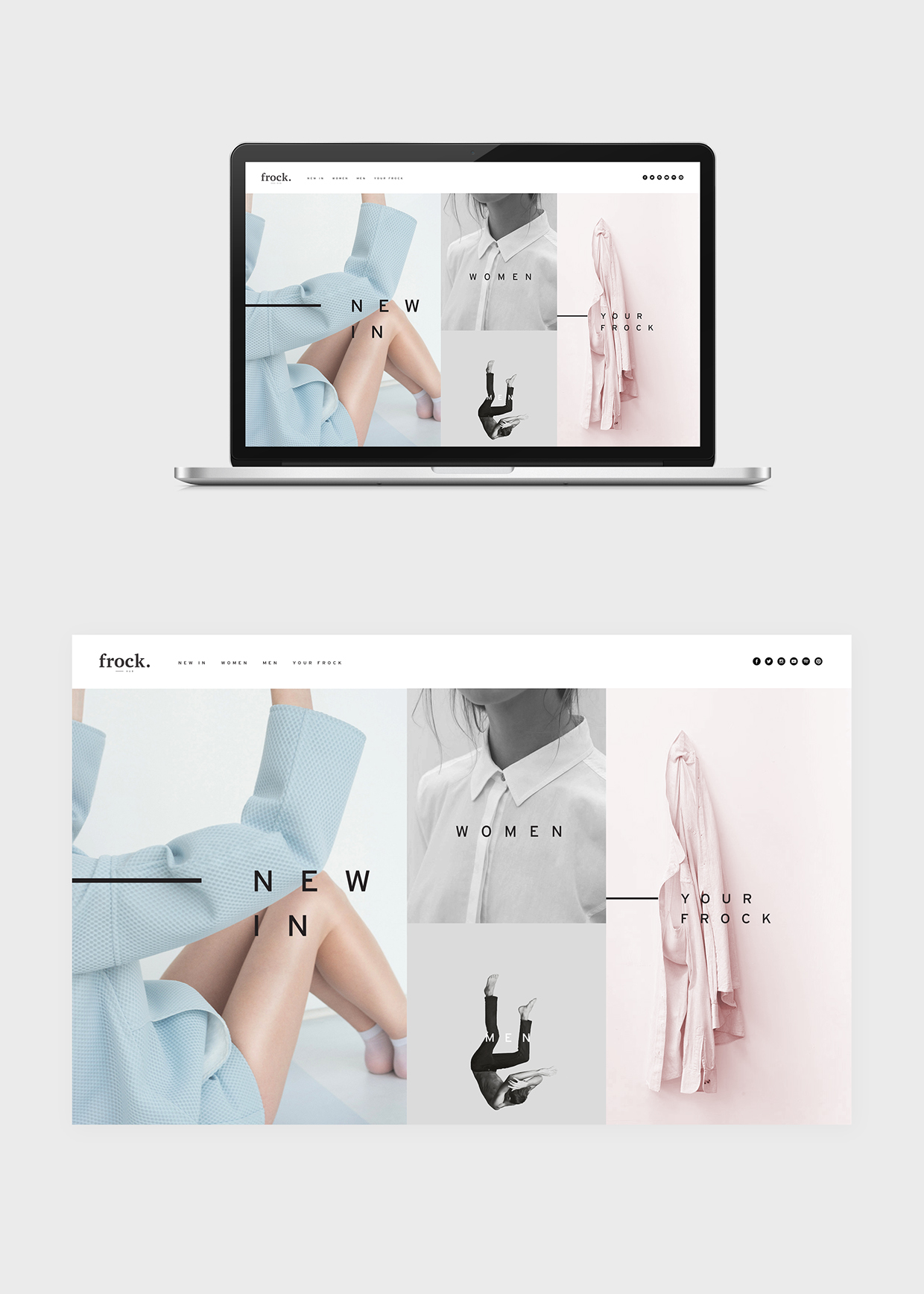
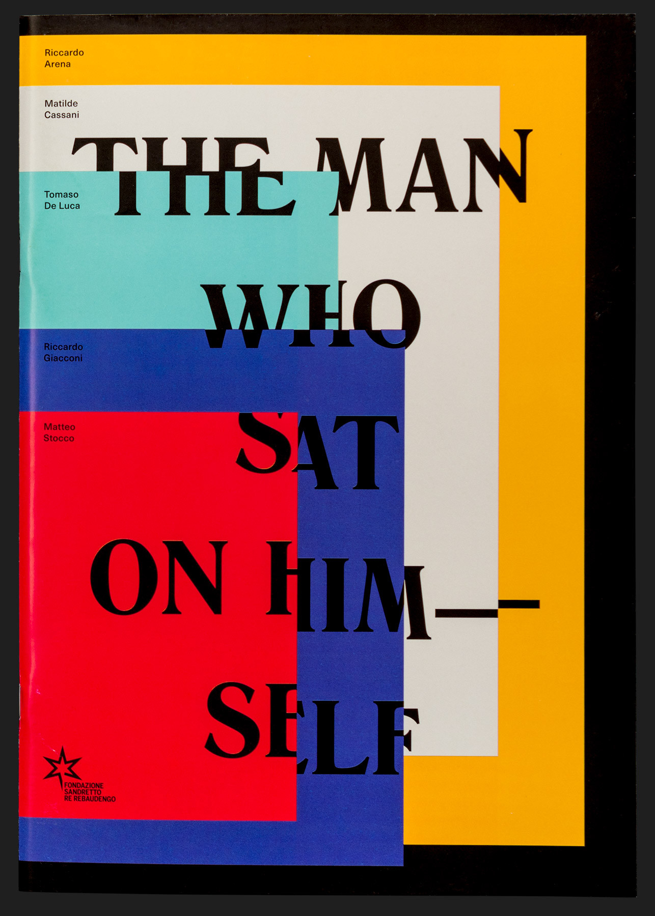
1. Text Over Graphics
Using text over the top of graphics is one way to create a layered and high contrast look. This is often employed across home pages on websites. Be careful when using this technique and always ensure the text is still legible. Choosing clean and simple images composed with ample ‘white space’ is a must. Furthermore stick with a clean, bold, san serif font for legibility.
When to Use
Great for the front covers of books, website home pages and posters. This look is often used within fashion, property development and homewares.
Our pick
Designed by Saxon Campbell
2. Frames
We saw the emergence of frames in layouts about five years ago. Many designers where using them on the covers of publications and on posters in 2012/13. This year we have seen them used both on websites and in print layout, packaging and advertising. Often teamed with bold simple typography.
When to use
Frames are a great graphic element that can finish off a design. They can be used to draw the eye to a particular point on the page or divide your layout into distinct areas. Another trend is to team frames with text that has been centred on the page.
Our pick
Designed by Pam & Jenny
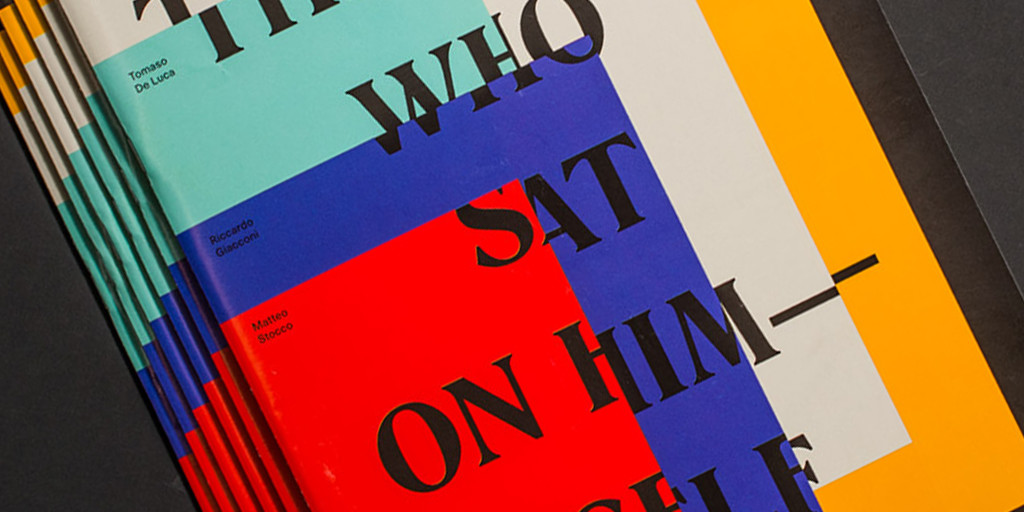
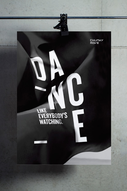
3. Letter Spacing
Using loose tracking (letter spacing) is sometimes used to turn headings into graphic elements rather than simply text. It is therefore often used for titles and display text. In more extreme cases the letters are cut from their text frames and incorporated into other design elements/images within the layout.
When to use
The technique is used across both print and web. It works really well for event posters, art and creative industries, writers festivals, music events and album covers.
Our pick
Designed by Motherbird
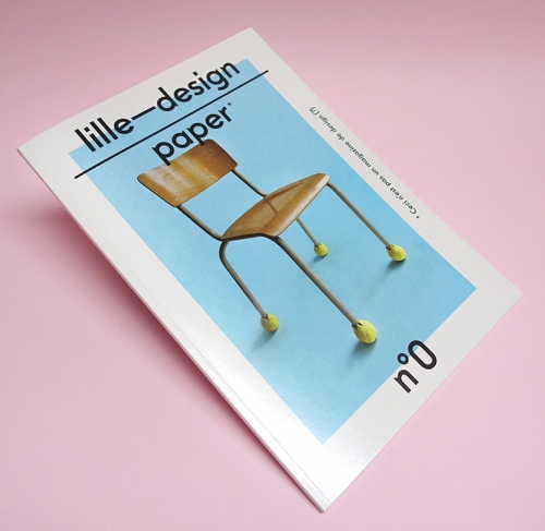
4. Centre Aligned Text
There was a time when centred text was only employed for more formal projects such as invitations and certificates. However these days it’s used across all manner of designs and layout. Often this form of centre justified text is used with striking and bold typography.
When to use
This has been used across book covers, posters and even packaging design. It works well for certain publication design.
Our pick
Designed by Studio Mut
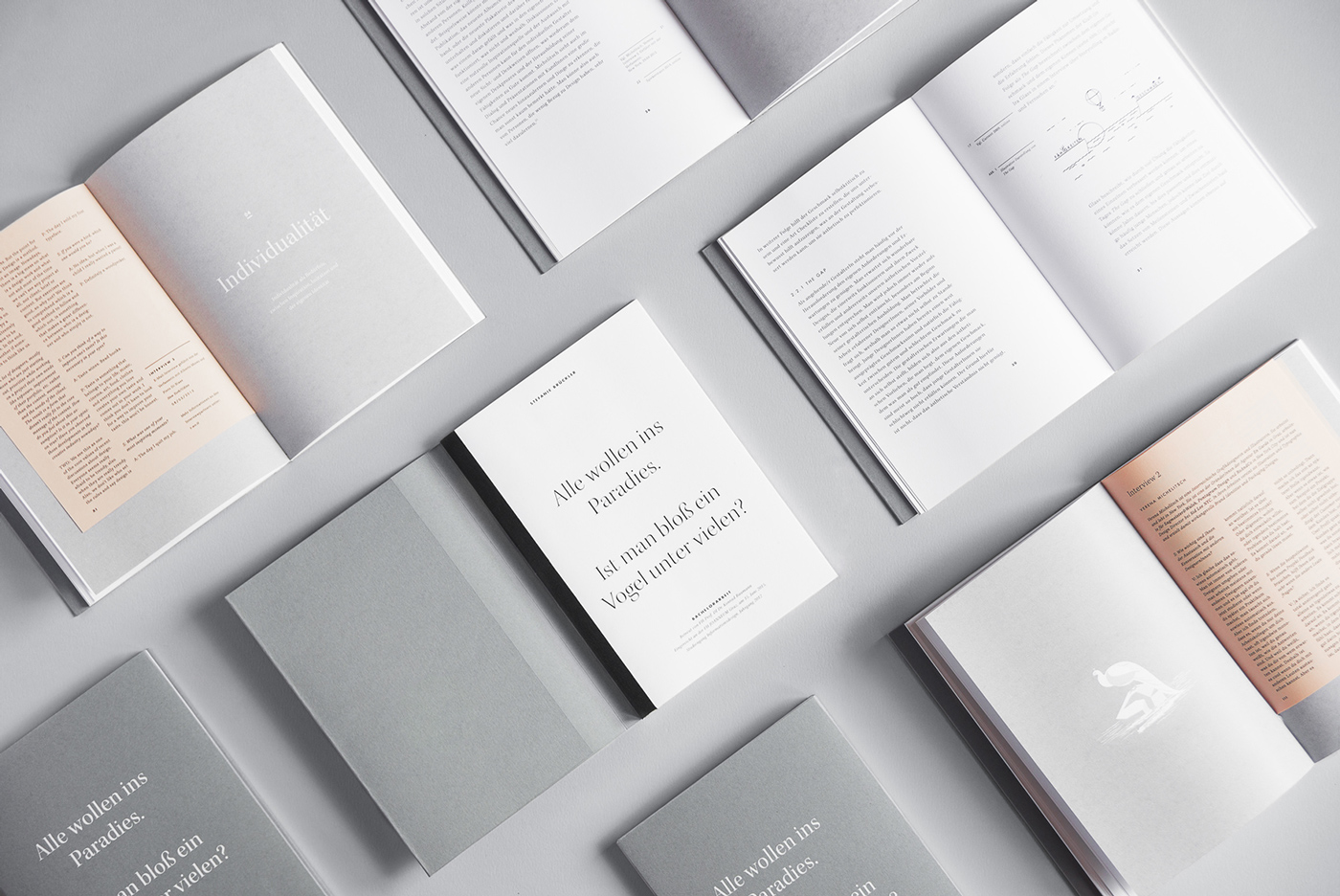
5. Minimalist
Plenty of white space allows your layout to breath. It can provide a certain elegance and sophistication to your work. If you are wanting to achieve an exclusive and upmarket feel this technique can help. It can also be used for design driven and highly technical content.
Strong attention should be given to your typography. Choose an elegant typeface that has enough personality to hold it’s own. You will also need to carefully consider the substrate you are printing on.
When to use
This approach works well for publication and packaging design. If you are targeting women or an audience that appreciates design this approach will appeal.
Our pick
Designed by Stefanie Brueckler
Start your own trend
This is by no means an exhaustive list. These are just some of the many trends we will continue to see well into 2016.
You may wish to use some of these approaches as a starting point. Or perhaps ignore them altogether and develop your own look. Either way, your target audience will be the ultimate judge.